
User login
Language
Anonymous's groups in this site
User is not a member of any group.
Your groups across all your sites
User is not a member of any group.
Recent Content
Who's online
There are currently 0 users online.
You are here
Coronavirus Maps: How Severe Is Your State's Outbreak?--NPR maps
Primary tabs
Mon, 2020-10-26 12:34 — mike kraft
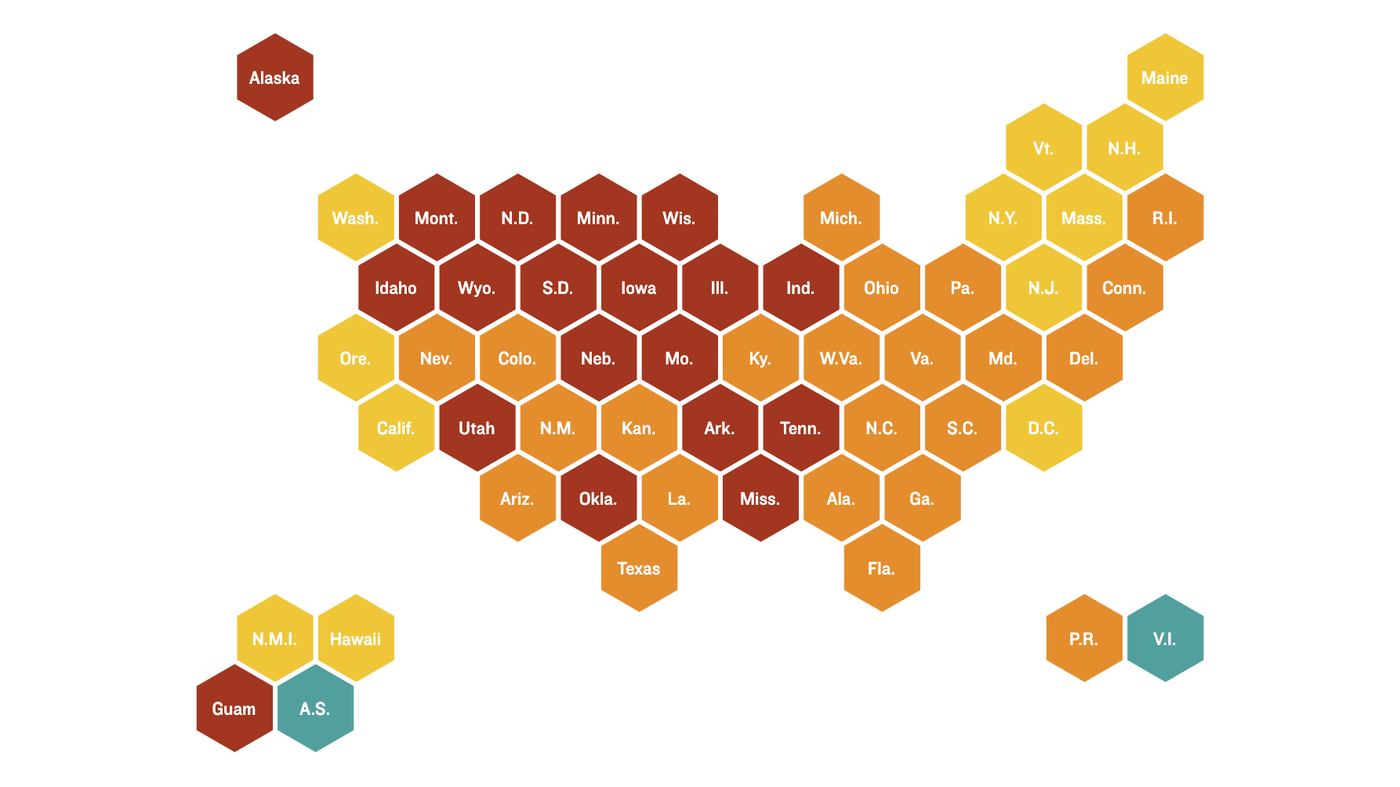
More than 8 million people in the U.S. have had confirmed coronavirus infections and more than 225,000 have died of COVID-19. Tens of thousands of new cases are reported daily nationwide. In the graphics below, explore the trends in your state.
View the data via a heat map (immediately below), curve charts, a table of state-by-state trends over four weeks, or a map of total cases and deaths. ...
Country / Region Tags:
Problem, Solution, SitRep, or ?:
Groups this Group Post belongs to:
- Private group -


Recent Comments